Web Design
Acronym
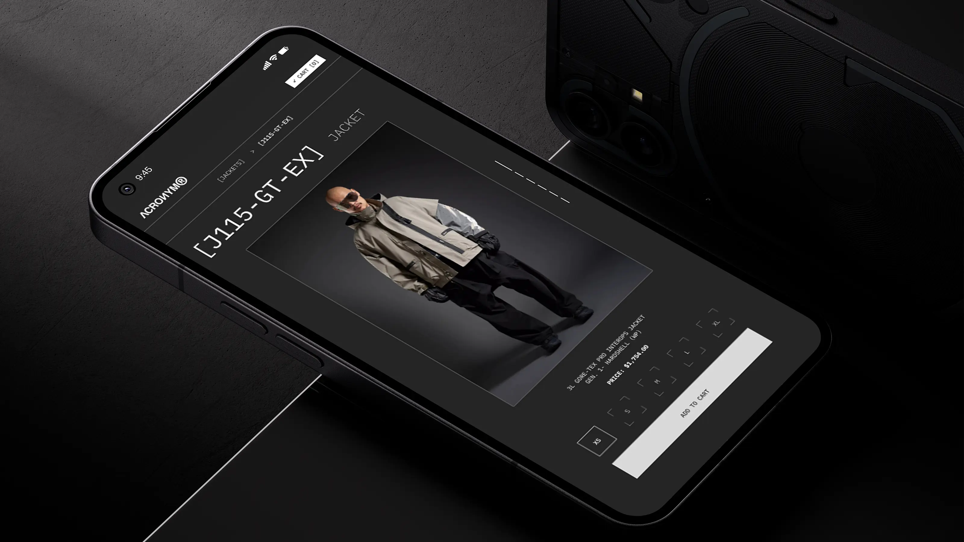
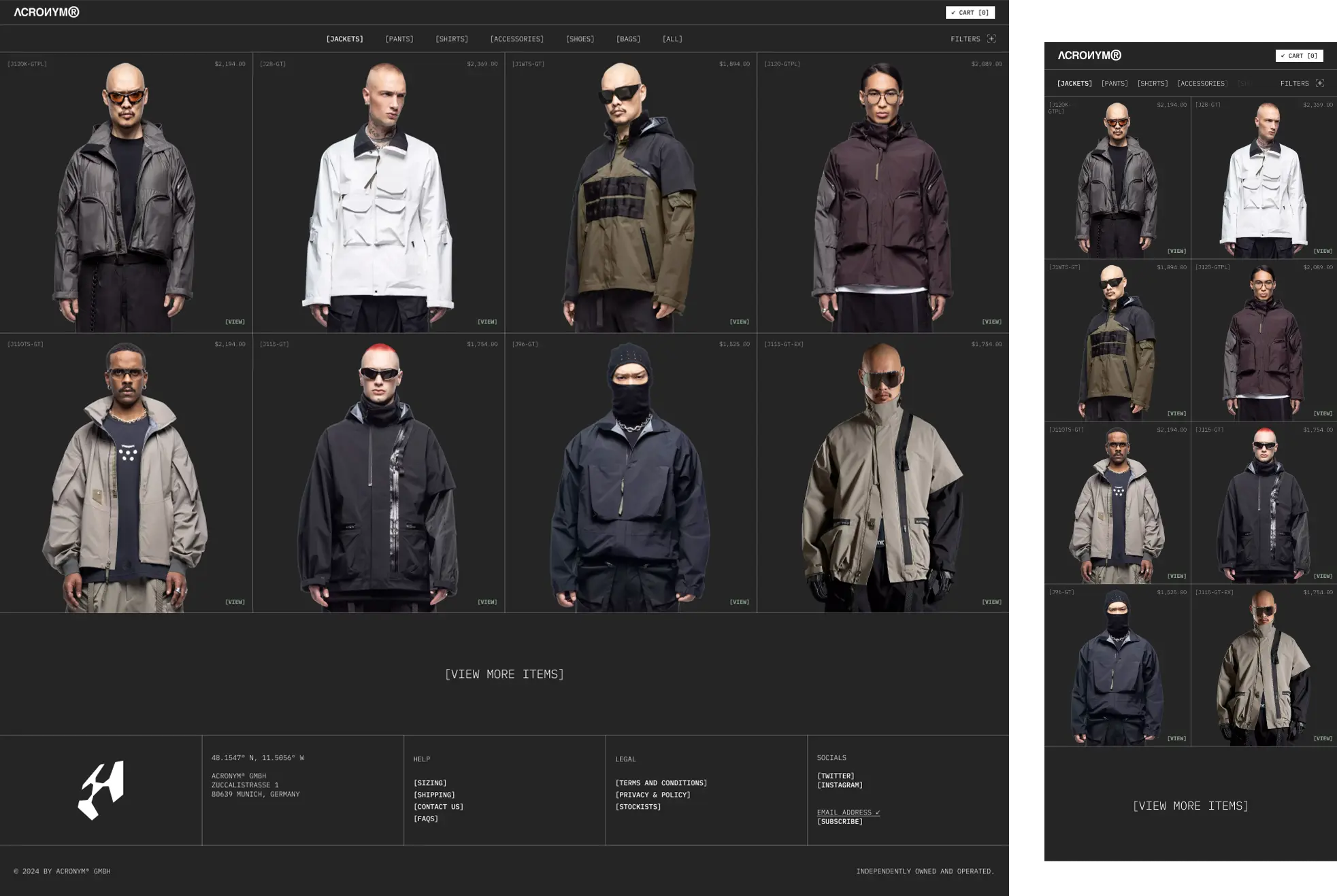
A redesign concept for Acronym’s e-commerce experience, built to translate the brand’s technical identity into a sharper and more navigable digital retail system.
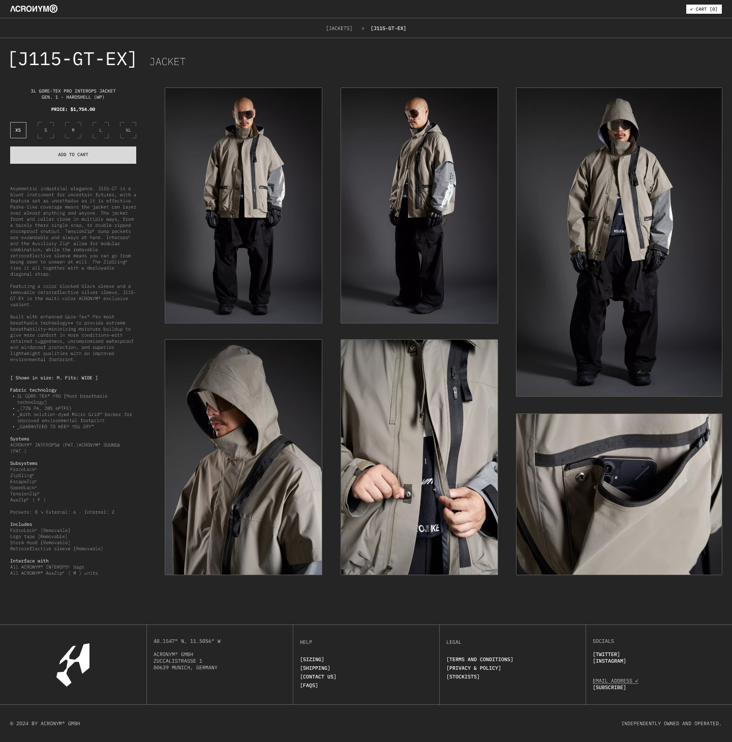
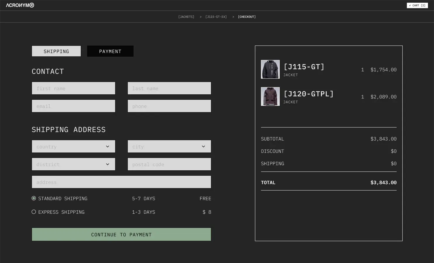
The project focuses on product clarity, visual hierarchy, and a more intentional shopping experience across key touchpoints.

Overview
The objective was not to redefine the brand, but to rethink how it performs online. The work explored a more structured and readable interface while preserving the distinctive attitude, density, and visual tension associated with Acronym.
Direction
My role focused on redesigning the e-commerce experience through interface hierarchy, product presentation, and navigation principles, with the goal of making the site feel more precise, immersive, and usable without losing its character.
Notes
What makes the project strong is the balance between brand intensity and usability.
Rather than simplifying Acronym into a generic luxury store, the redesign aimed to retain its technical and editorial identity while improving browseability, product discovery, and overall retail coherence.